I tend to spend hours on adjusting my own designs, be it for a blog that I manage or a new website that I want to build. I always feel like I need to try every possible combination to see which one felt the most appropriate. Keep in mind, I do love minimalism, and I hate when there are too many things going on at once, at any given page.
In some ways, this is where typography can really come in handy, and take away the strain of having to focus on the overall page design, when we can just emphasize the most important parts using good typography. I’m the cheapskate, so using Droid Sans is my kind of thing, but besides Droid – there are thousands of fonts to choose from. What makes typography important?
One too many fonts is going to prove to be a very distracting feature to your readers, so finding the right combination is a must. Good typography combinations will provide a pleasant – mood enhancing – reading/viewing experience that will surely gain you some credibility points. It’s funny how such small things can make such a huge impact.
Typography Will Set the Mood
I suppose it does set the mood, every time. As you might’ve guessed, good typography choices will have a positive effect on the overall mood it sets, while bad design will leave the user with questions like; does the web designer knows what he is doing, or is this site really credible and secure? You don’t want to lose potential customers over silly choices.

You could say that great typography is invisible, because it flows so smoothly with the rest of the page design that you don’t even pay attention to it, and even if you do – you do it because you’re amazed at the choice of the web designer. Wouldn’t you want to be that guy who gets praised? Make better typography choices, and you will be!
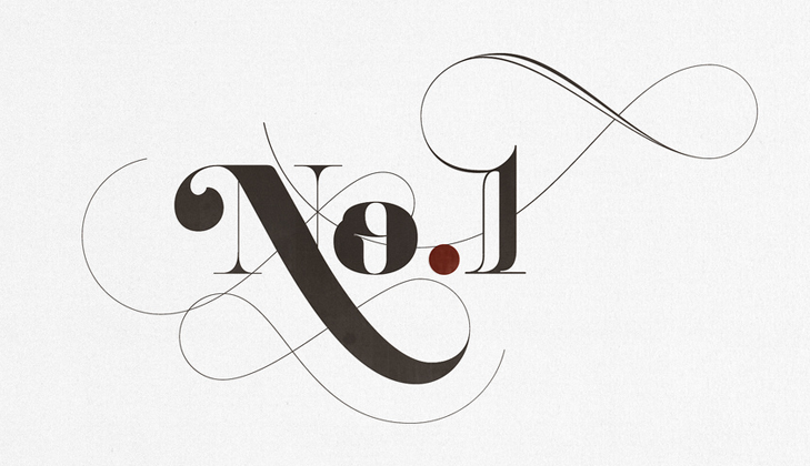
Balance Your Font Faces
I use one font on all my pages, two at most. Two, because I feel like the sidebar is a different part of my website, so I try to make it so; overall, I try to make the website feel as one, rather than trying to emphasize different things with many different font faces. Take a look at the following image.

Amateurs and novices love to do this, pick ten of their favorite fonts and then bombard their pages with them. Don’t do it. It will cause people seizures, and it will make them hate you more than they hate waking up early in the morning. True story.
Always design through the eyes of another person, we – tech enthusiasts – have different eyes for quality and comfort, sometimes – it is good to switch back to the normal human eyes and see your design for what it is.
Content Choreography
To this day, this is one of my favorite articles on the subject of typography placement on a web page, the natural flow of a good font, and how content stacking works. It is an article that has aged over time, but it does emphasize media-queries (mobile devices), and how designers are too hyperactive when it comes to applying changes.

Media queries can be used to do more than patch broken layouts: with proper planning, we can begin to choreograph content proportional to screen size, serving the best possible experience at any width.
Line Spacing Makes a Huge Difference
Learning to recognize the difference in line spacing can be a major deal for any project that involves tinkering with typography. Line spacing is nothing more than what the two words mean, the spacing of the lines between the lines of your text. The more you move them apart, the easier it becomes to read, as funny as that might sound. Your line spacing should, as a rule of thumb, be about 0.3em-0.5em larger than your font size, although it can different depending on your design. Although that’s a rule of thumb, recognize that the leading should differ depending on your choice of font as other fonts might require more or less leading.

You can clearly see that the second paragraph looks a lot better, and is much more easy on the eyes, providing a better reading experience. As well as more fluent flow of letters, making it much easier for people of all ages to read and comprehend the text.
Importance of Typography
It’s crazy how one small feature such as a font you’re using can have such a drastic impact on how people percieve and look at your design, products and reputation as a whole. If you’re into selling things, take a look at this article from KISSmetrics, it’s a nice overview of how typography affects conversion rates, and when you think about it – you could be missing out on more dollars due to your typography choices!
I’m traditional, I don’t play with the big guns, and I don’t bother analyzing and testing tens of different fonts, I know which ones work for my audience, and so far – nobody has complained about readability issues. Apart from that one time.
About the author: Alex has been working with the web for nearly ten years, his experience ranges from single tasks like managing a website, to full blown web development, mostly within his own projects. Find more of his writeups on CodeCondo.
Image credits: arnoKath, squidspot, micah, trentwalton, thedesigncubicle

Bhavia
27 Aug 2014Great write up. This is so true that if the right fonts are not used, then it might have a major impact on user experience. The line spacing and choosing appropriate fonts may seem to be very small things, but they have a huge impact on your website.
I read a nice post on how fonts affect the user experience. Anyone interested, can have a look at it here – http://sixrevisions.com/user-experience-ux/fonts-ux/#comment-262477. According to this post, even the size of the font can improve your sites user experiences.
danadesigns
31 Aug 2014Never underestimate the power of type faces – well said!
Diana Azura
1 Jun 2015Great post, very informative, thanks.
I like to experiment on typography whenever there is extra time. It’s simple but not at all easy. I get a lot of confusions while i work on this but the good thing is I learn and improve myself in typography every time. That’s what i love.
(Bookmarked)