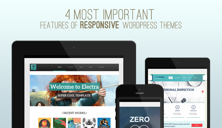
It seems that everything is responsive these days, but when it comes to selecting a WordPress theme, you need to keep a lookout for more than just “responsiveness.”
Responsive WordPress themes need to possess specific attributes alongside their responsiveness to make it a good choice. Merely being “responsive” isn’t enough, and moreover, can be used as a label by poor quality theme designers. With that in mind, allow me to spend some time here to talk about what I believe to be the top 4 features every WordPress theme that claims to be responsive should have.
Easy-to-Access Menu

You probably already know that an easily accessible menu is a must for good web design. And this applies to responsive themes, too, no matter what size the screen currently is.
To clarify, a menu that looks great on your desktop needs to look great on your smartphone and tablet, too.
Menus typically shrink down from the standard list across the top of the page into a drop down style when the screen size decreases. This is perfectly acceptable, of course. It just needs to be apparent that this is what has happened to the first-time visitor.
Good Cross-Platform Design

The best responsive WordPress themes look and feel as they should regardless of what operating system or browser they’re accessed on. To put it another way, nothing should go “wonky” between Chrome, Firefox or Safari on any platform.
Beyond just working properly, the very best themes will look exactly the same no matter the platform on which they’re viewed. That’s the mark of truly excellent design.
Logical Scaling

Some theme developers think of responsive themes in terms of their ability to shrink down. Of course, shrinking down to fit on a smaller screen does not make a responsive theme a good theme unless we’re talking about them in the most rudimentary of terms.
A truly responsive theme will scale down logically. The content, graphics, and menus will shift into an appropriate format based on screen size. Mere shrinking would mean large images would stay large and big text fields would stay big.
Each tier of a responsive theme’s design needs to be customized for that specific screen size. No exceptions.
Prominent Social Buttons

While perhaps not the most essential from a design standpoint, social buttons that remain visible on any screen size improve the chances of your content being shared. And with more and more people accessing websites via mobile devices, this is an increasingly important thing.
There is no more “I’ll go share that when I’m on my desktop.” You need to offer your social account info up front so those who want to spread the word can do so with just a single tap.
Conclusion
Responsive WordPress themes are here to stay. They mark an essential trend in web design as a whole. And while you might think you’re safe to pick any old theme that says “responsive” in its description, there’s a little bit more to it than that.
I’m always an advocate of doing your research before committing to anything. So, make sure to look into the details of any theme you’re thinking about installing before doing so.
What features do you find to be the most important when selecting a responsive WordPress theme?
About the author: Tom Ewer is the editor of the ManageWP Blog, a freelance writer and a professional blogger.


Larry Brians
23 May 2014Responsive is a demand for today’s market so it must be proper integrate so that user can gain maximum experience
shira
28 Oct 2014Great post, very helpful!
One question: about #2-good cross platform design: How do I check it previous to buying the theme?
Thanks in advance
Shira.
tesla
29 Oct 2014Usually it is stated in the Theme Description or you can always ask the Developer through a private message.
Best regards,
TeslaThemes