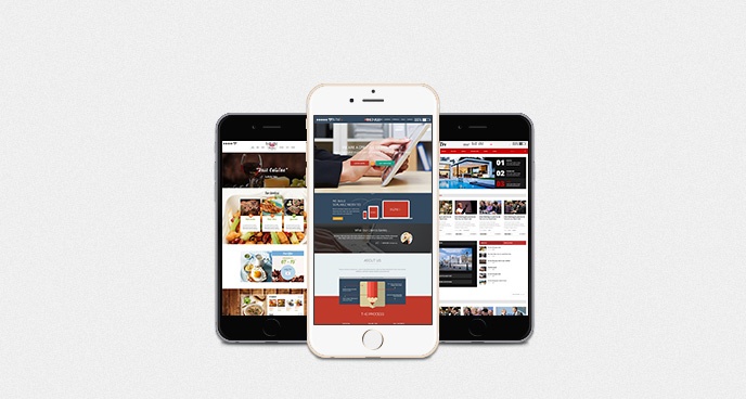
Unless you have been living under a rock for the past six months, then chances are you have heard about Apple’s biggest update yet. Yes, we’re talking about the iPhone 6 and iPhone 6 Plus. This new release has left many web designers wondering if the new screen sizes would have an impact on their web design. In this article we will try to answer some of these questions.
Screen Size
Of course web designers are wondering what impact the new screen size will have on their designs. Until now all designers had to worry about was one screen size and one resolution. However, with the new iPhone 6 and iPhone 6 Plus, you do not only have to consider screen size, but also resolution.
The new iPhone 6 comes in two different sizes, the iPhone 6 has a 4.7 inch screen and comes with a screen resolution of 750px by 1334px, while the new iPhone 6 Plus has a 5.5 inch screen with a resolution of 1080px by 1920px. In terms of CSS dimensions this translates to 375px by 667px for the smaller iPhone and 414px by 736px for the larger version. So you have to declare a smaller CSS width to achieve the best quality on devices with high pixel density (PPI – pixel per inch). Here is a useful source listing all the dimensions.
This diversity in screen sizes is pushing web designers to create layouts having in mind a wider range of resolutions. In the same time, the latest iPhones have the same size as the most of Android smartphones, this gives the possibility to unify the design process for both platforms.

Responsive Design
As smartphones and tablets have become more and more popular, so has the use of responsive design. Responsive design in essence means the website is displayed according to the screen of the device and not the device itself. In other words the website will react to the screen size of the device and not whether the device was created by Apple, Samsung or Sony. So in other words, as long as you set a minimum width for your website, then the site will automatically adjust to the size of the screen on the device it is being viewed on.
In essence, if your web design is currently working with previous versions of the iPhone, and working with different Android phones, then it is pretty safe to assume that it will also work on the new iPhone 6 and iPhone 6 Plus.
It’s also interesting to note that iPhone 6 Plus is almost the same size as iPad mini, and is “eating” from its market share. According to recent stats it captured 41% of all US phablet sales. Web designers will for sure follow the evolution of phablets and adjust the responsive design specifications (especially for horizontal apps).
Device Pixel Ratio
Perhaps the biggest change to the new iPhones is the Device Pixel Ratio. This is the ratio between the logical pixels and the actual physical pixels. In other words, as we mentioned earlier in the article the CSS dimensions compared to the physical pixels on the screen. For the iPhone 6 this means 375px by 667px compared to 750px by 1334px, if you do the math, then this means the iPhone 6 has a Device Pixel Ratio of exactly 2. For the iPhone 6 the numbers are 414px by 736px compared to 1080px by 1920px, which actually equates to 2.6 however, Apple has decided to try something called rendered pixels which brings the Ratio to 3.
So if you are already providing 3x images for Android devices, such as the Galaxy S5, then these images will automatically be used for the iPhone 6 Plus, the only difference being that safari will resize the image before they are displayed on the screen.
![]()
Conclusion
It would be easy to say that the new iPhone 6 and iPhone 6 Plus will radically change the way web designers work, but the truth is if you have made sure your design is responsive, then chances are it will look just as good on the new iPhones as it does on Android phones of similar size.
Different screen sizes aren’t something earth shattering, in fact Android Phones come in just about every screen size available. It is impossible to create a perfect experience for every smartphone and tablet on the market, and that is exactly why responsive design was invented in the first place, so if you plan ahead and incorporate Responsive design into your web design, then you should be ready for users visiting your site from their iPhone 6 and iPhone 6 Plus.


