Pretty often, after we have come up with the necessary item, we face a complicated shopping cart design, with multiple odd fields that draw our attention away from the focal point. The latter can make users simply leave this store and look for a better organized one, with usable shopping cart that won’t require hours to be filled out. In order for this not to happen, we have decided to share some basic effective tricks on how to develop cool shopping cart designs that would make your visitors come back.
A usable shopping cart design is the core of any ecommerce website. It not only provides users with a more enjoyable shopping experience, but also helps site owners to boost sales dramatically. To put it short, an effective shopping cart design should be easy to use, pleasant to the eye, and feature no extra elements that can make the buying process complicated. You should allow your customer to select all products he/she is interested in, preview the things they want to buy, and finalize the order. That would be the perfect scenario. Let’s now discuss it all in detail.
When at the grocery store, you need to keep your shopping cart handy in order to drop all necessary items there. Imagine that you can take it with you and the shopping cart stays in one corner of the store while you are walking through aisles and have to keep on returning to the basket each time you have picked something new. That’s rather inconvenient, don’t you think? The same happens with online stores. Rather often shoppers have to go to a specific page to check out the number of items they have already added to cart, which results in poor sales. Just to make it more convenient, think about these useful tips and tricks:
Use a cart icon
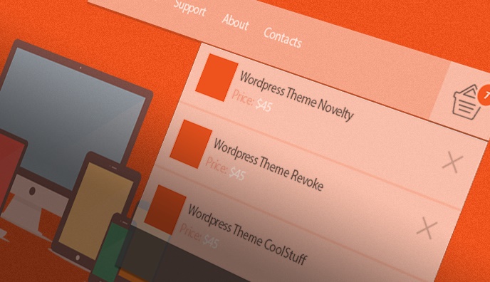
You can place it in the header of your website, which would show the number of items in their baskets. This will help you improve their shopping experience and give buyers an opportunity to go to the full page cart whenever they need. So, don’t forget to provide a link between the mini cart and the full page cart.

Make the checkout process easy for the user to follow
You may opt for a step-by-step or one page method, which will smoothen things down for your buyers. Have a look at the image below. This is Crocs checkout page. Applying one page method, they offer customers to complete one action at a time by filling in shipping and billing information, choosing payment method, and proceed to checkout in the end.

This allows users to fill quickly the relevant data and proceed to payment within one page. You can also run different Multivariate or A/B tests to see which is the most efficient checkout page structure for your site.
Shopping online, we want everything to be clear and simple. The same deals with ‘buy now’ buttons. As a rule, people get frustrated when they have to search for a button to push in order to add products to cart. Not being able to find the complete order button to finalize the purchase, people leave in search of better options somewhere else.
Make ‘buy’ buttons easy to reach and use
Highlighting these with some bright hues will only benefit your business.

Remember that not all shoppers who have come up with your online store are advanced web users. Most of them are not as tech savvy as you may think, so getting back to the products list after making a purchase may be a complicated thing. So, by adding ‘continue shopping’ link to the shopping cart you will make your web resource look more user friendly.

Use a clear table layout with readable fonts
Try to avoid bright, complicated backgrounds that would only distract user attention. It’s recommended to opt for table based structure when it comes to the full page shopping cart design. Thanks to clearly set borders, user will be able to differentiate information in the table. Adding images to text information, you can let users preview the items added to shopping cart and make them sure they had made the right choice.

For those buyers who have never come across online shopping, it would be helpful to provide them with prompts. Adding quick tips, sample text and tooltips you can give a hint on how to fill in the fields without much effort.
These are the key things you should take into consideration when designing a shopping cart page. Let’s see how these techniques are used in practice. Look through these cool shopping cart designs and get inspired.
Shopping Cart Design Inspiration
AE

Apple Store

Guess

D&G

HTC

Mango

Shopbop

Bobbi Brown Cosmetics

Tiffany&Co

The Greeting Farm

As you see, a cleverly designed, user-friendly shopping cart can do magic. There are so many factors to consider when working on one. However, if just for some reason you do not have enough time or patience for creating this on your own, there is always a way out. The web is flooded with so many made designs with cleverly organized shopping carts that you do not have to worry about the convenience of the latter when picking these for building an ecommerce site.
Which shopping cart is best for you? Which of the aforementioned techniques would you like to try on your website? Do you know any other effective ways of developing usability design? Share with us in the comments section below and don’t forget to share this tricks with your friends by pushing social share buttons.
About the author:
Written by Katherine Crayon, copywriter reporting on tech news and all aspects of the web design industry. Anyone looking for a magic kicker to get your own online business started meet her in person on G+ and Twitter.


Ray Weigel
16 Nov 2014Great examples and good tips. For people modifying existing carts we would add to avoid editing original php template files and keep changes to CSS when you can do so. That way design changes won’t get overwritten when the cart gets updated. Thanks for the quality article!!!
R
picklink
18 Jan 2015Nice article, but I think the perfect “merge” between this article and Tesla should hace been those recommendations applied to one of their themes.
Amy Tang
10 May 2017Nice to read. So useful and informative tips. Many thanks for sharing them all.